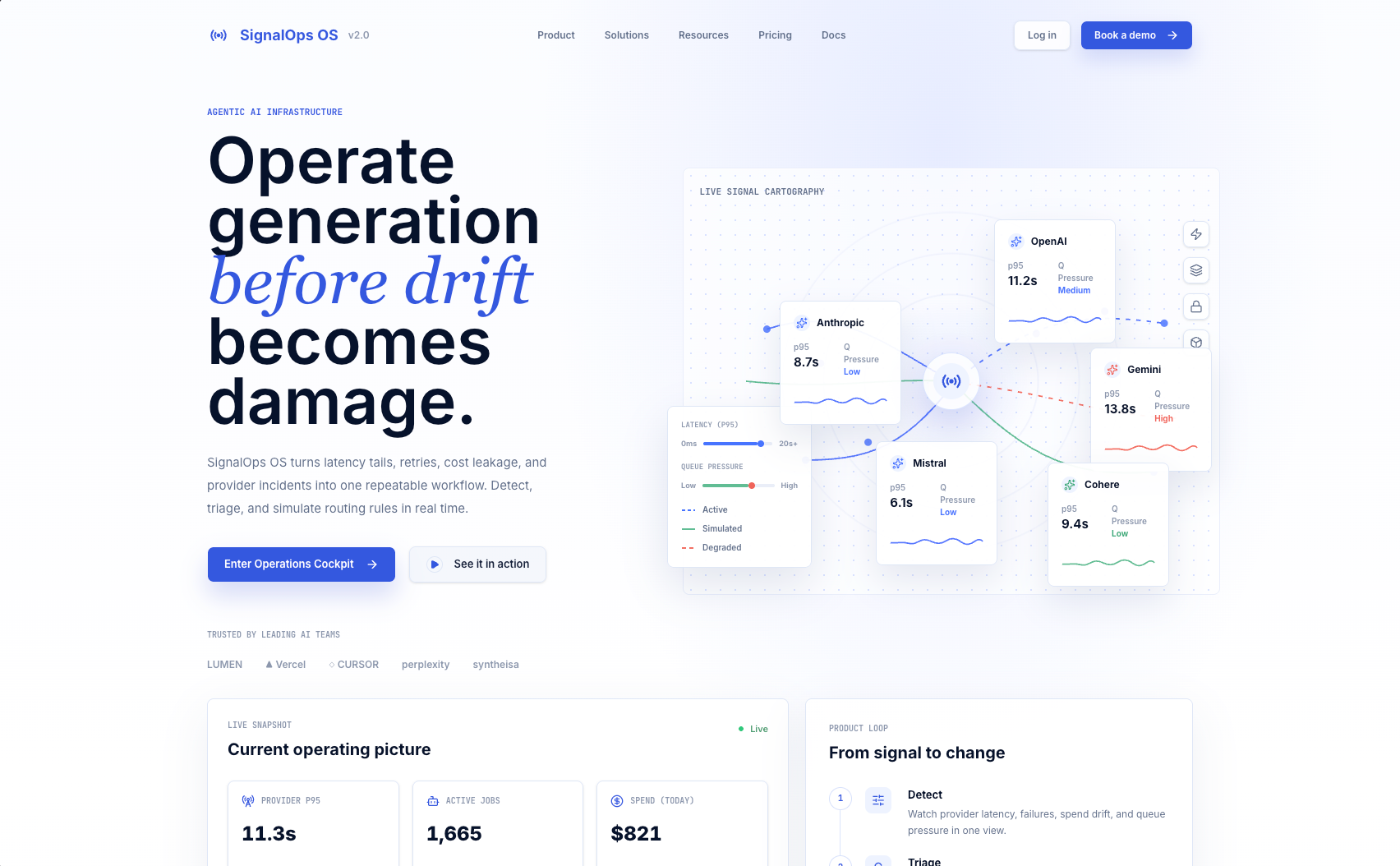
The pitch
Image-generation infrastructure runs across multiple providers — fal.ai, Google AI, Alibaba/Qwen — and each one fails differently: latency spikes, retry storms, cost bleed from silent retries. An operator needs to notice the problem, trace it to affected jobs, draft a mitigation, see the projected impact, and hand it off. Most dashboards stop at "something is red." SignalOps tries to close the full loop.
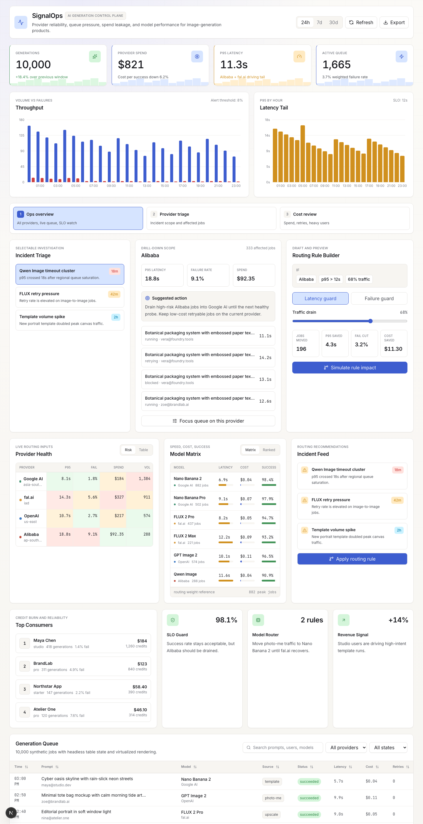
The main screen is a decision surface: provider health cards, live KPI tiles, an incident timeline, a 10,000-row job queue, and a routing-rule builder that previews impact before you commit. Every control drives shared React state, so changing a filter or sliding traffic share re-renders charts, cards, and tables from the same source.
Guided incident replay
The feature that separates SignalOps from a static dashboard is guided incident replay: a step-by-step walkthrough that drives the real dashboard controls from a script instead of manual clicks. Three scenarios ship today:
- Alibaba p95 spike — critical latency tail on Qwen Image after queue saturation
- FLUX retry storm — elevated retries on fal.ai image-to-image inflating failure rate
- Qwen cost bleed — the same latency incident seen through a finance lens, where retries burn credits
Each scenario advances through five steps: signal → affected jobs → draft mitigation → projected KPI delta → export handoff. Every step sets concrete dashboard state (saved view, provider filter, trigger mode, traffic share, routing applied), so the operator sees the same controls move as if they were operating them by hand.
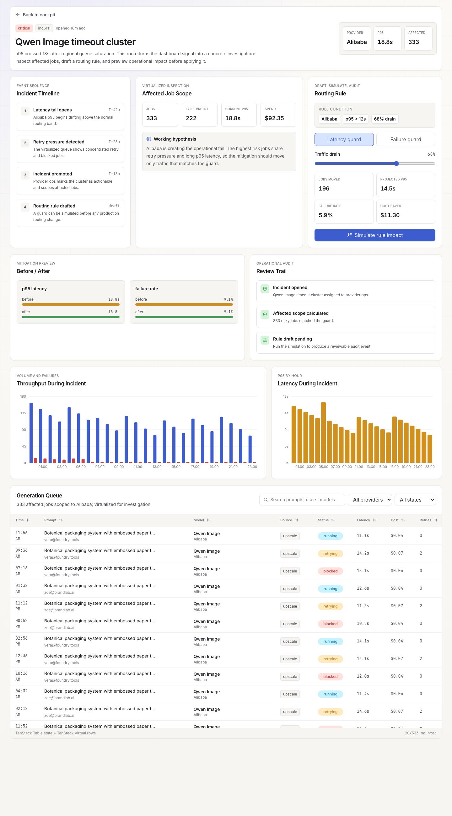
The replay is not a video or a mockup. It drives the real TanStack Query hydration, the real TanStack Table + Virtual row rendering, and the real Recharts memo-derived series. The proof callouts on each step name the implementation: "TanStack Virtual filters 10,000 synthetic jobs to the impacted provider with only visible rows mounted," "Applying the rule rewrites derived provider/timeline memos, so KPI cards and every chart re-render from one source."
Saved views and the routing builder
Three saved views reframe the same data without changing route:
- Ops overview — all providers, live queue, SLO watch
- Provider triage — incident scope and affected jobs, filtered to the flagged provider
- Cost review — spend, retries, heavy users, shown through a finance lens
The routing-rule builder sits inside the investigation flow. It offers two trigger modes (latency guard, failure guard), a traffic-drain slider, and a live impact projection: jobs moved, p95 saved, failure-rate cut, cost saved. The impact numbers recompute as the slider moves, because they derive from the same memoized data that feeds the charts.
Stack decisions
TanStack Table + TanStack Virtual over a dropped-in enterprise grid. The generation queue hits 10,000+ rows. TanStack Virtual keeps only visible rows mounted, and TanStack Table gives column-level control over sorting, filtering, and status badges without pulling in a heavy grid framework.
Recharts for charts. The latency timeline, throughput area chart, spend donut, and performance scatter all share memoized series derived from the same TanStack Query snapshot. One useMemo per chart series; no duplicate data fetching.
Framer Motion for replay transitions. Each replay step animates in/out with AnimatePresence, so the narrative panel and step rail feel like a guided presentation rather than a form submission.
One source of truth for dashboard state. Saved view, provider filter, job status filter, trigger mode, traffic share, and routing-applied flag all live in a single ReplayState object. The replay sets this state; manual controls set the same state. Charts, KPI cards, and the table all read from it. No shadow state, no stale closures.
What it shows
- Route-level product flow: overview → incident detail → affected jobs → routing preview → export.
- Dense data UI: provider health, KPI tiles, timeline, 10k-row virtualized table, five chart types, and a rule builder in one viewport.
- Operational state: saved views, provider focus, selected generation status, simulated routing impact — all driven from one state object.
- Design-system discipline: restrained color palette, consistent tokens, readable data hierarchy, no decorative chartjunk.
Why this exists
Phosphene is the product. SignalOps is the kind of internal surface that product would eventually need: provider latency, retry clusters, generation cost, and user-facing credit impact all in one place. It is intentionally small, but it is shaped like a real tool rather than a dashboard wallpaper. The guided replay turns a demo into a narrative — you don't just see data, you walk through an operational decision.